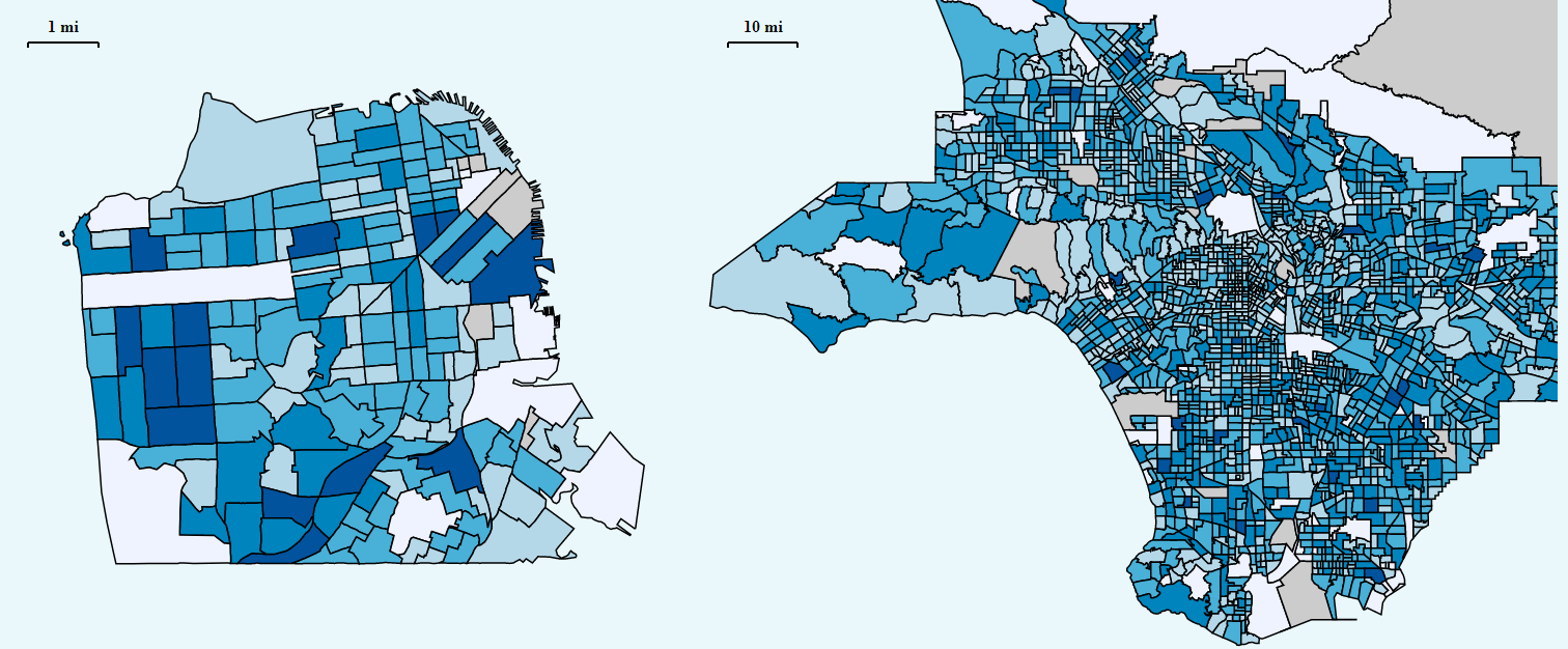
Los Angeles v. San Francisco
In 2015, I won the “data visualization of the year” award at UC Santa Cruz for my work comparing the gentrification trends of Los Angeles and San Francisco’s metro areas. I worked on this project as my senior project for the brand new course, Intro to Data Visualization and later generalized the code when I became a Teaching Assistant for the class the following year.
UC Santa Cruz, Introduction to Data Visualization Student Projects
In 2016, I was the teaching assistant for two quarters of the senior level Introduction to Data Visualization course. I helped over 50 students with the ideation, design, and execution of data visualizations across a myriad of topics. Below are some examples, click on each to see/interact with the visualization yourself.